Today’s leading marketers increasingly understand the importance of landing pages.
Not only do landing pages help drive specific actions (like purchasing your product or creating an account), they help companies generate more leads.
One study found that companies that publish between 10 and 15 landing pages on their sites enjoy a 55% uptick in leads. Believe it or not, businesses that publish more than 40 landing pages on their sites do even better.
Why do landing pages work?
The more landing pages a business has, the easier it is to segment an audience. Create targeted landing pages for each customer segment to increase the chances the content converts. For example, you could build separate pages to target to different genders, age groups, or income levels.
It makes good logical sense to do this. A 20-year-old college student likely won’t be interested in the same content that engages a 68-year-old retiree.
Unfortunately, it’s not as simple as publishing any old landing page and seeing instant results. To maximize ROI, companies need to develop a solid landing page optimization strategy and continuously improve it.
Getting Started with Landing Pages
The good news is that this isn’t as hard as it might sound. There’s no shortage of research available that can be used to develop a landing page strategy that makes sense for any business — including this handy guide we put together that explores how to build high conversion landing pages.
Here are some inspiring stats to get started:
- Landing pages that include photos of real people can increase conversion rates by over 50% compared to stock photos. People like authenticity.
- Customer reviews featured on landing pages boost conversion rates by over 18%. Actual customer feedback is persuasive. People trust reviews by existing customers.
- In one HubSpot study, a red call-to-action button outperformed a green one by 21%. Colors matter more than most people think.
Attention Spans are Short
It’s no secret in the age of information overload that it’s increasingly harder to capture someone’s attention. Whereas the average person had a 12-second attention span in 2000, the average attention span today is just over eight seconds. That’s right, human attention spans have reached goldfish territory.
Since it’s likely that you don’t have a ton of time to engage your audience, it’s important to create incredibly effective landing pages from the beginning. A page that loads slowly, isn’t well-designed, or isn’t mobile-optimized probably won’t convert too many would-be customers.
It’s worth noting that — even with our short attention spans — website visitors don’t mind spending time watching videos.
In fact, while only 20% of website visitors read content, 80% will watch videos. The average viewer is willing to give video content 2.7 minutes of their time. That’s great because 95% of the folks who watch videos absorb the message.
Suffice it to say that videos, when utilized correctly, are an integral component of successful landing pages. In some cases, videos have proven to increase conversion rates by 86%!
What is a landing page?
First, let’s cover the basics. What exactly is a landing page?
A landing page is a section of a website, usually a standalone webpage, that contains content meant to drive a specific action. For example, a company might hope that a visitor will sign up for a free trial of their product, download their app or exchange their contact information for access to a gated asset (like a white paper or ebook), among other things.
Successful landing pages are:
- Easy to understand. Landing pages should instantly and clearly convey a business’s desired message to the visitor. If pages are cluttered or hard to follow, visitors will likely leave a site and look elsewhere for what they want. Don’t be afraid to get straight to the point: Landing pages with ad-related content generate 115% more leads that landing pages with generic content.
- Mobile-optimized. We all know what it’s like to try to access a site that isn’t mobile friendly. To convert, landing pages need to be mobile optimized. Believe it or not, 53% of users will leave a mobile site if it doesn’t load within three seconds!
- Intuitively designed. Landing pages must contain clear calls-to-action that aren’t invasive. Less is more. Simpler is better. Reduce clutter and avoid unnecessary forms and fields. Research shows that reducing the number of fields in a form to four or fewer can increase conversions by 160%!
Now that we’ve looked at why landing pages are important and have explored their most important parts, let’s turn our attention to 10 amazing landing pages to see what makes them so special.
10 Examples of Oustanding Landing Pages
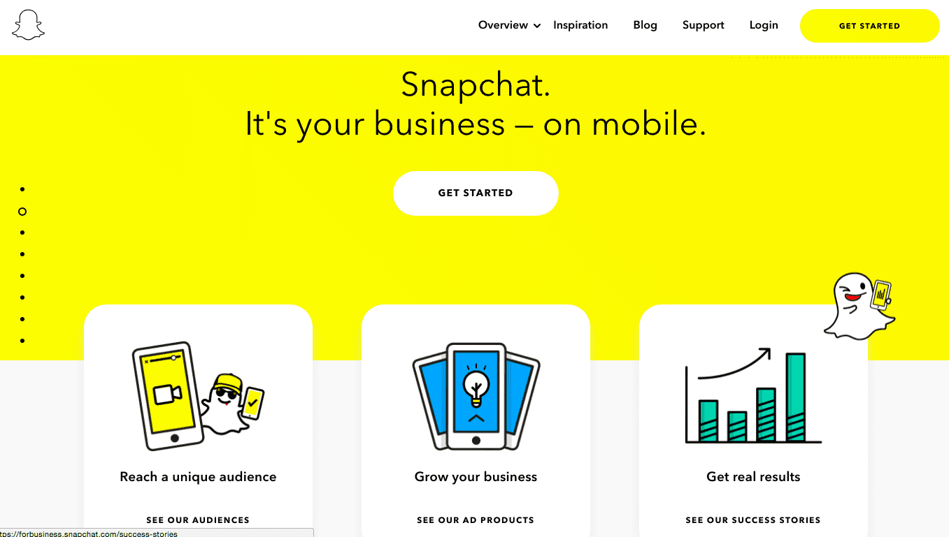
1. Snapchat for Business
Snapchat, the ephemeral social messaging platform, generated $230 million in advertiser- funded revenue in the first quarter of 2018.
How was the fledgling social media company able to secure so much revenue in three short months? Take a look at the landing page they use to recruit new advertisers.
We like the simplicity and engaging images of their main selling points. The overall theme is playful and easy to understand, similar to the app.
It’s serious business getting advertisers to fork over millions of dollars. This is why Snapchat’s main advertising products (Audience Profiles, Unique Ad Units, and Success Stories) are prominently featured above the fold. Their most impressive statistics are on display just below.
Not surprisingly, there’s also a catchy one-minute video featuring real people. You can see how many of the themes we discussed earlier are in play.
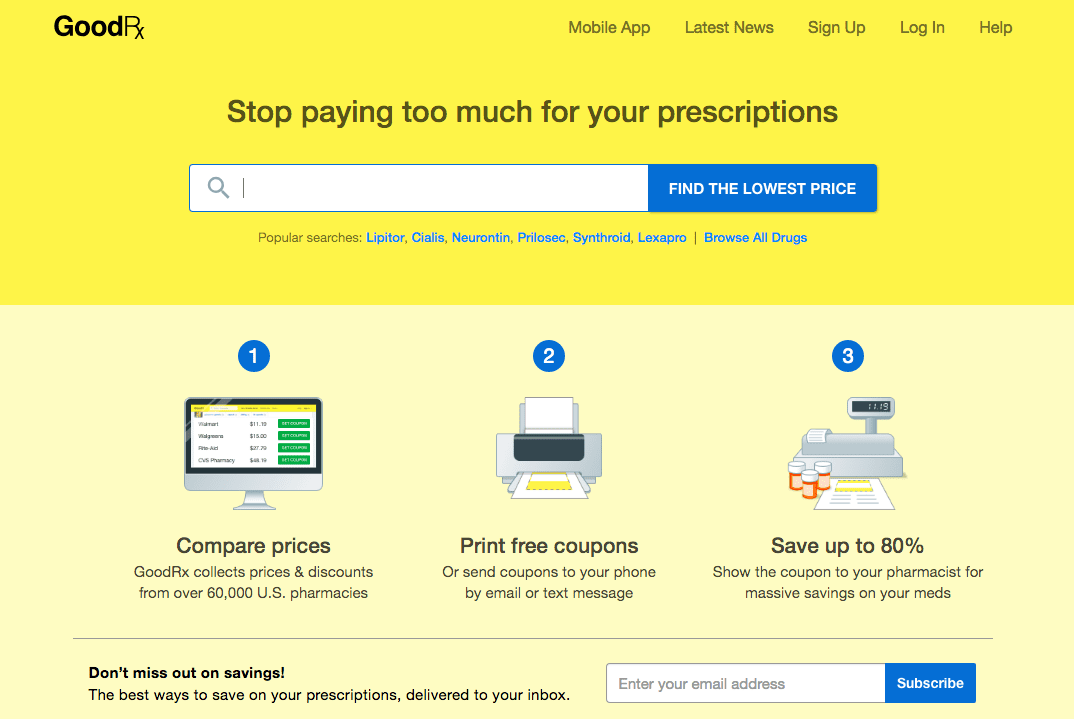
2. GoodRX
GoodRX is a website that helps patients find low-cost prescription medications.
The company knows that the majority of their visitors are there for price comparison purposes. We like that the search field, the most valuable feature of the website, is prominently displayed.
The company also lists the most commonly searched for drugs underneath the search field as clickable hyperlinks. This lets visitors to find what they’re looking for in one or two clicks — without having to type a single letter.
This landing page proves that the fewer hoops a visitor has to jump through, the better the user experience will be.
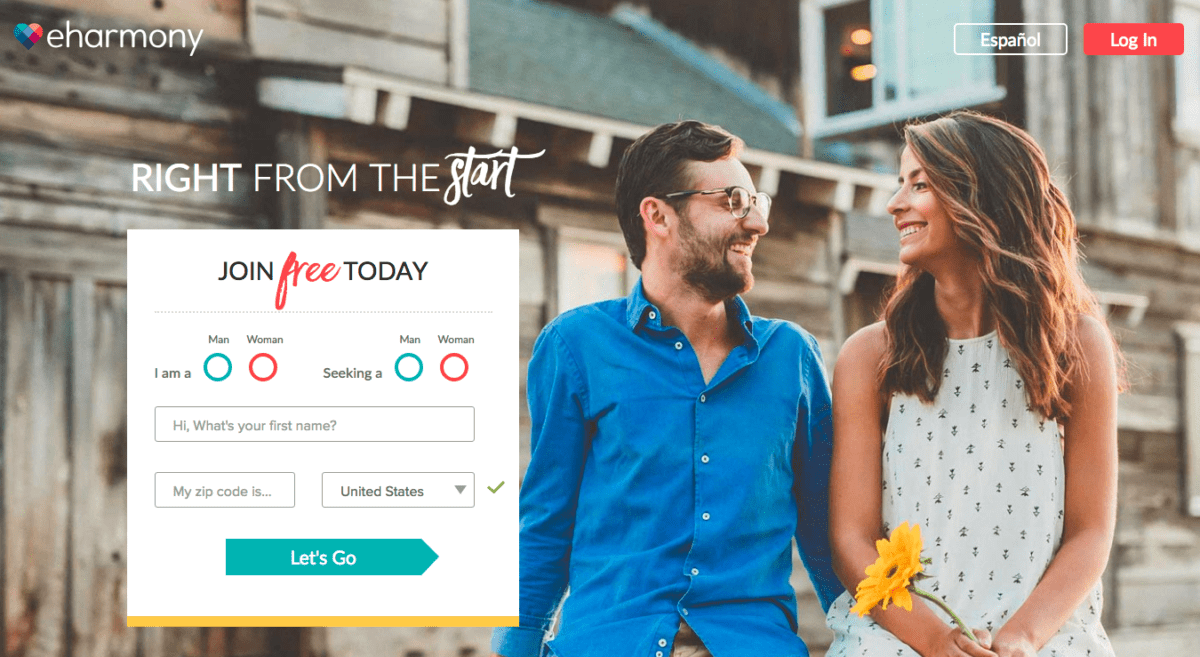
3. eHarmony
eHarmony is an online dating platform that has been connecting couples since 2000.
Here’s what their landing page gets right: A real image of a happy couple is impossible to miss. Since folks go to eHarmony looking for a partner, the picture establishes trust and helps convince the visitor they too may end up in a happy relationship if they use the site.
The landing page also features a quick and easy sign-up form with few fields. The words “start” and “free” also stand out on the page, serving as a bit of subconscious persuasion that helps draw in leads.
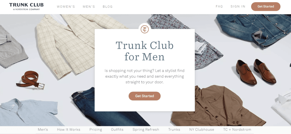
4. Trunk Club – New York
Trunk Club is an online personalized stylist and clothing company that sells apparel through the mail and in select brick-and-mortar stores.
Upon visiting Trunk Club’s New York market men’s landing page, users are greeted with a chic assortment of shirts, pants, shoes, and accessories. Scroll down passed the Get Started prompt, and Trunk Club’s value proposition — high-quality clothes picked out by personal stylists on your schedule — is featured front and center.
This geo-targeted page contains a short video about how Trunk Club works (noticing a trend here?), explains pricing and encourages visitors to drop by their physical location in the city.
To encourage action, several calls-to-action are cleverly featured throughout the page.
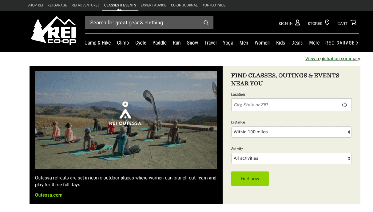
5. REI
One of the United States’ premier outdoor recreation retailers, REI sells sporting goods, camping gear, clothing, and more.
The company also offers outdoor classes and other kinds of programs. The landing page REI uses to promote these events is worth taking a look at.
Right off the bat, a search bar is front and center at the top of the page. If there’s a particular piece of clothing or equipment a visitor is interested in, they’ll simply type a word or phrase into the search bar and search the results. This design makes perfect sense, as REI’s primary goal is selling products.
Scroll down a bit and you’re greeted by a zen image of a yoga class in the mountains. The picture is accompanied by an easy-to-complete form that only requires visitors to input their zip code (the other two fields have drop-down menus).
Below the form, events are clearly separated by topic. The page also features several how-to articles and videos, delivering value to those who want to learn more about the outdoors.
At the bottom of the page, there’s a prompt that asks for feedback, as well as a simple call-to-action asking visitors to sign up for REI’s email list.
The combination of all of these elements makes the page a winner.
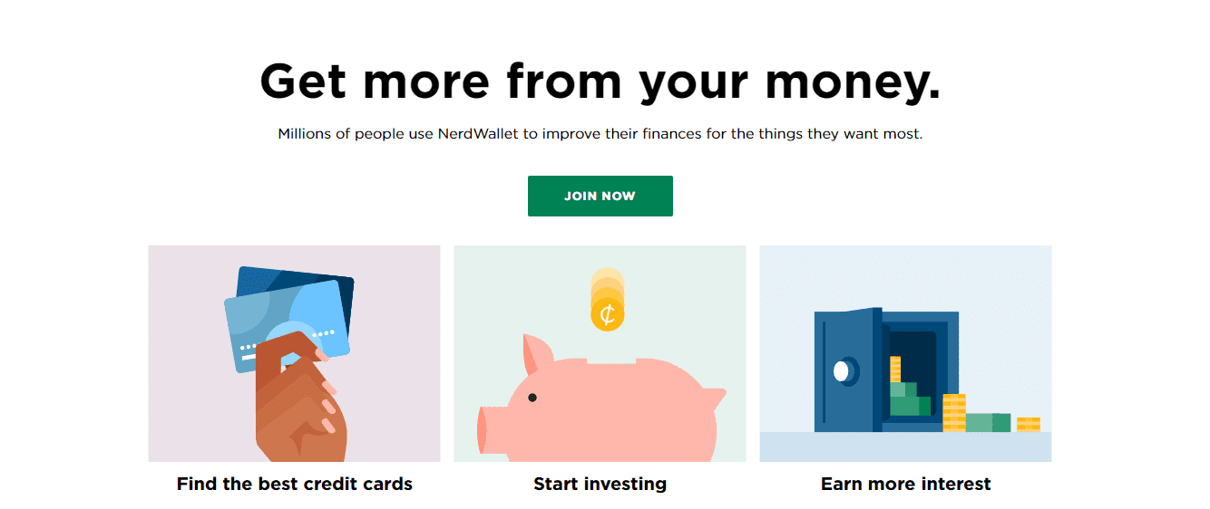
6. NerdWallet
NerdWallet, a personal financial website, has a very simple yet very effective homepage. Visitors are immediately greeted by a persuasive call-to-action. Whereas many landing pages encourage users to “sign up,” NerdWallet conveys more urgency with “join now.”
The landing page also features six clickable images toward the top, each of which link to their core services. The images are illustrations with a playful side, which offer a nice contrast to the financial industry itself, which can be intimidating to the everyday consumer. The intuitive layout ensures users know exactly where to click, and the simple yet powerful copy piques interest and encourages action.
NerdWallet’s other sell points are below the fold (like security, privacy, and partners). At the bottom of the page, users are prompted to download the company’s mobile app.
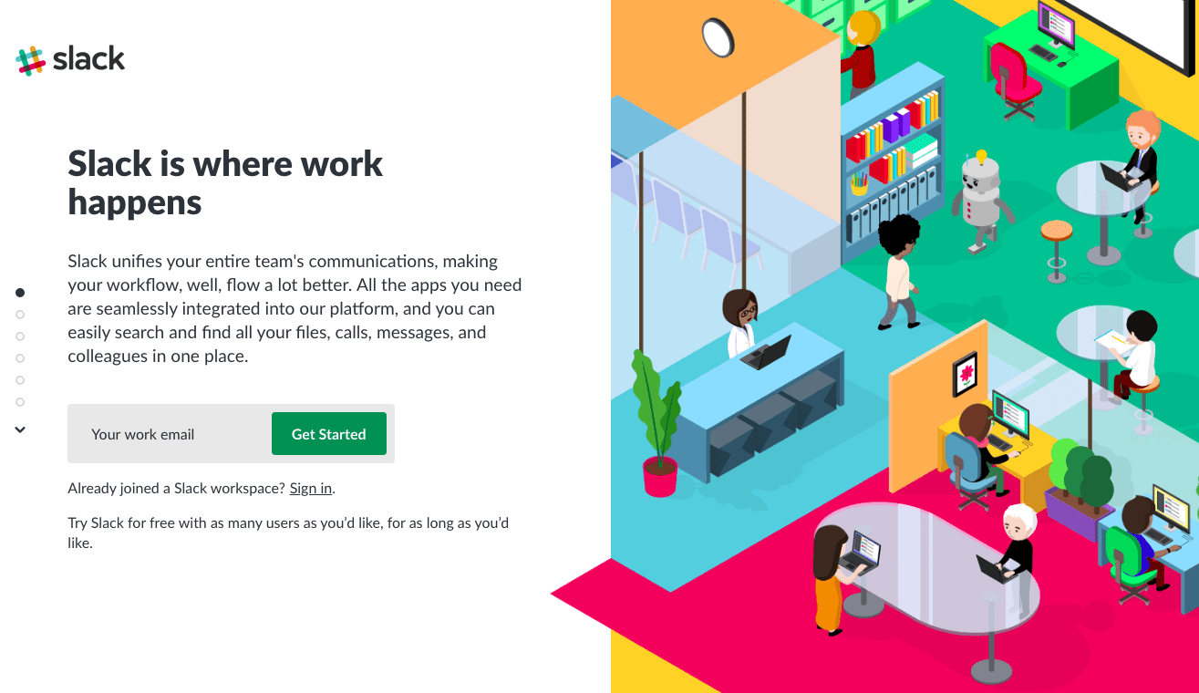
7. Slack
As a leading workplace collaboration platform that helps thousands of teams across the globe, Slack knows a thing or two about acquiring customers.
The sign up form is front and center, which tells us that email marketing is critical to their sales strategy. Cleverly, they specify that the visitor should enter a work email, which probably improves their lead quality. Well played, Slack!
An impressive list of clients follows below the fold, including Airbnb, Samsung, and NASA, which helps establish Slack’s authenticity and authority.
There’s also a very subtle offer for an unlimited free trial for unlimited users, which is rare for the SaaS space (and one that we here at Robly certainly appreciate!). If someone’s in the market for a workplace messaging app, why wouldn’t they try Slack after learning about that amazing offer?
Finally, the image on the landing page is vibrant, featuring a diverse team of workers in a modern office environment — which is exactly the kind of customer Slack wants to attract.
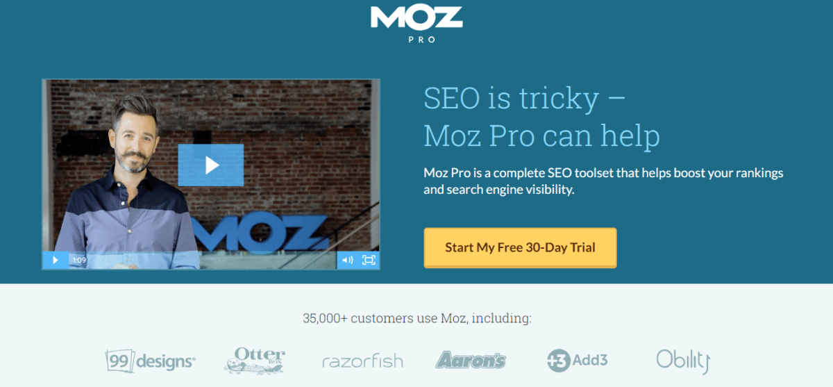
8. Moz
Moz, an SEO and inbound marketing platform, has built an entire business around content and website optimization.
Countless websites follow the company’s data-backed optimization strategies, so any theme that appears on a Moz landing page is not there by chance.
Once again, there’s a short one-minute video with a real person, along with a clear, concise headline. As most people familiar with it know too well, SEO is tricky. Folks who arrive at this landing page are almost certainly looking for help. In short order, Moz shows they can provide it.
To establish credibility, Moz notes that over 35,000 customers use their platform.
Notice how there is no menu bar anywhere on the page. The only clickable units are the video, the free trial button, and one of their client’s names. Giving visitors fewer options increases the chances they’ll perform a desired action.
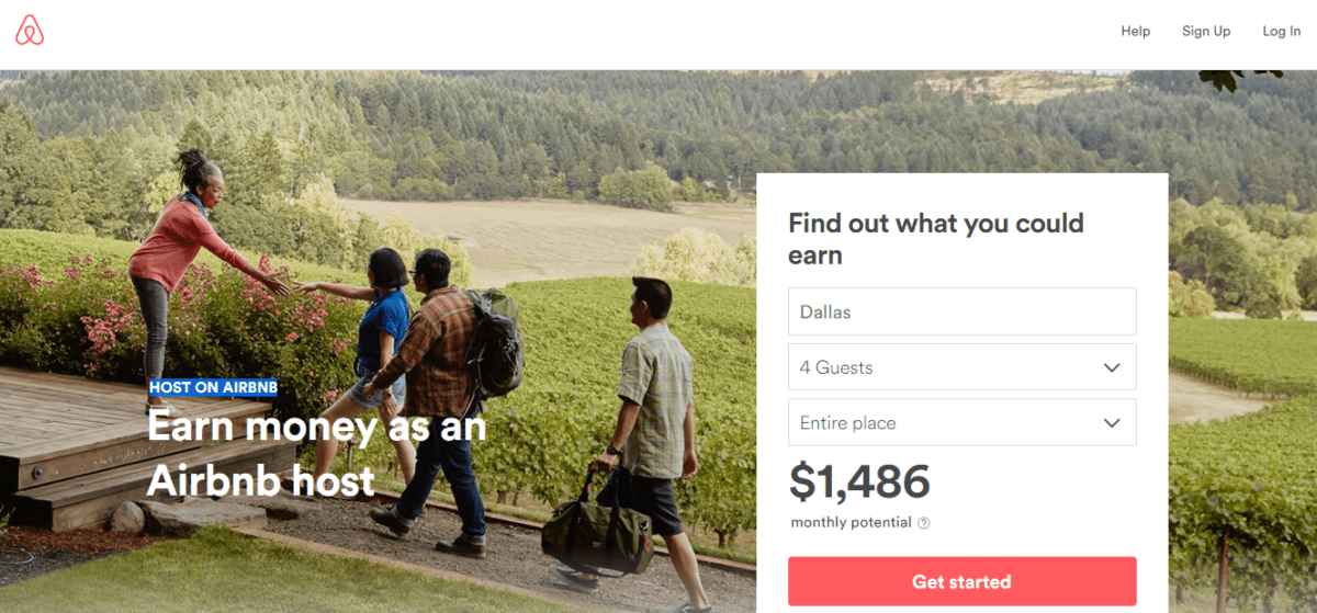
9. Airbnb
Encouraging folks to open up their homes to strangers isn’t the easiest thing in the world.
Here’s an Airbnb landing page that helps remove some doubt. Who couldn’t use an extra $1,500/month renting out space that would otherwise be unused?
The image embedded in the background of this landing page illustrates Airbnb’s value proposition: a group of happy travelers getting to stay at a beautiful private residence they otherwise wouldn’t know existed while the host makes money.
Airbnb highlights how easy it is to get started as an Airbnb host below the fold. Create a listing, invite guests, and get paid. Simple and easy.
Further down, Airbnb outlines the protections it offers its hosts (like a $1 million host guarantee) and provides answers to several popular FAQs. The page wraps up with a call-to-action that visitors can click to begin listing their properties.
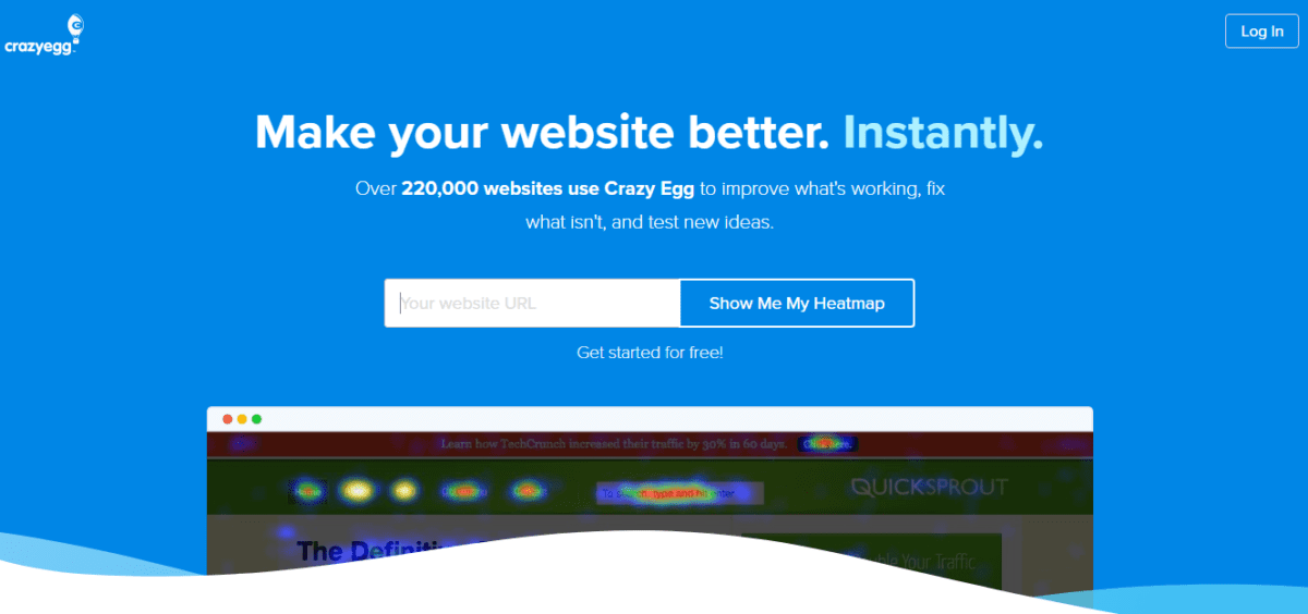
10. Crazy Egg
Crazy Egg builds tools that lets businesses to learn and collect data about how users interact with their website so they can further optimize their site.
One of those tools is called a Heatmap, which tracks a visitor’s journey through a website. It looks at where they come from, where they click, how long it takes them to click, why they leave, and more.
That data can be incredibly helpful. To encourage first-time visitors to give their tools a whirl, Crazy Egg offers a free 30-day trial; visitors need only create an account to get started.
It’s also worth noting that the use of the word “instantly” as a standalone sentence does a great job of conveying ease-of-use and urgency.
In Conclusion
For even more examples of successful landing pages, check out Kissmetrics, Instagram and LinkedIn. What elements do you notice these landing pages have in common?
Now that you have a good idea of the components of an effective landing page and have seen several real-world examples of pages that convert, it’s time to begin your journey of developing a landing page strategy so you can build your first several pages.
Don’t go it on your own, either. There are tons of landing page software tools — like HubSpot, Marketo and Instapage — that make it relatively easy to optimize landing pages without the need to hire developers.
Despite how important landing pages are, less than half of marketers use them for each campaign. Right off the bat, companies that use landing pages regularly gain a few steps on half of their competitors.
It’s time to get started on landing page creation and optimization. We look forward to seeing what you build!
What other elements of landing pages do you think are useful? Got any favorite landing pages of your own? Share in the comments!